RegTech Strategy | Risk Management Frameworks | Executive Dashboard Design | Data Visualization | Strategic Facilitation
UOB x Synpulse: Award-Winning Risk Supervision Ecosystem
Architecting a proactive, data-driven RegTech solution for global banking risk management.
Key Objective: To engineer a proactive risk-management framework recognized by Regulation Asia for excellence in reporting. By implementing a modular, highly customizable design system, I aimed to streamline the data-to-decision pipeline, allowing global banks to adapt the platform to their unique risk frameworks without sacrificing user experience.
Challenge:
How might we transform fragmented, high-density risk data into a cohesive "CXO-View" that enables decision-makers to identify and mitigate institutional threats in real-time?
The Client:
UOB
(commercial and private banking)
UOB
(commercial and private banking)
My Role:
Lead Product Designer
Spearheaded the strategic UX framework and modular design system for high-stakes risk reporting and executive oversight.
Lead Product Designer
Spearheaded the strategic UX framework and modular design system for high-stakes risk reporting and executive oversight.
The Delivery:
- Executive-Level Strategy: Orchestrated a series of Strategic Design Thinking Workshops to align senior stakeholders on target audience psychographics and behavior. This moved the project from raw data requirements to a goal-oriented journey focused on prompt risk mitigation.
- Information Architecture for Complexity:
Developed a "Discovery-First" IA using advanced navigation patterns (Global Nav, Hierarchical Tabs, and Breadcrumbs). This reduced cognitive load for executives navigating deep hierarchies of risk information.
- Intelligence-Driven Interface Design:
Engineered high-utility search and filtering systems that provide "Escape Hatches" for complex data queries. By implementing contextual filters, I ensured that massive datasets were instantly distilled into meaningful trends and actionable insights.
- Scalable Design Language: Created a Modular Component Library featuring "Discoverable Controls" and data-dense table patterns. This system ensures that the platform remains highly customizable for different banks while maintaining a consistent, award-winning CX.
The Impact:
🚀 Award-Winning Market Recognition:
Delivered the core UI/UX for a solution recognized by Regulation Asia for excellence in Risk, Data, and Reporting (2023).
🚀 Decision Velocity: Streamlined the "Time-to-Insight" for CXOs by consolidating complex regulatory data into succinct, actionable visualizations.
🚀 Institutional Scalability:
Built a flexible, modular design architecture that allows rapid customization for various banking risk frameworks, significantly reducing implementation timelines for new clients.
Design
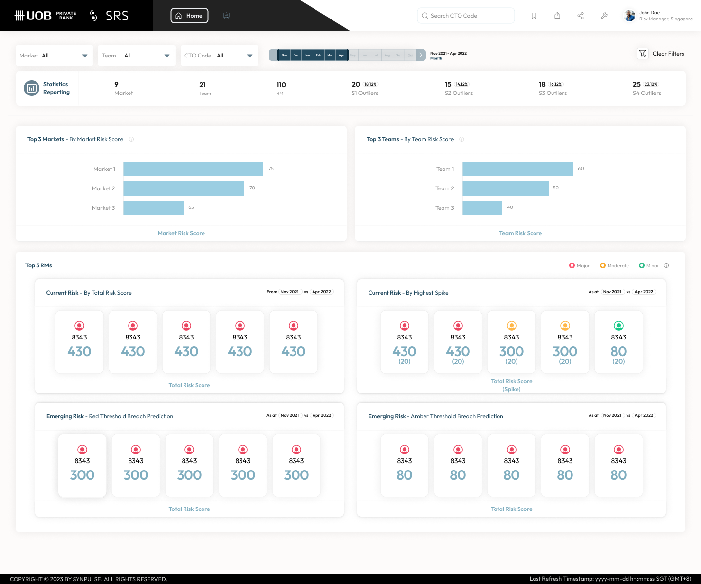
Fuss-Free & Cohesive CXO-viewOffers a straightforward and succinct perspective of a FI’s risk status, facilitating decision-makers to take prompt action on potential risks.
Tool: Figma
Highly Customizable based on Banks’ Risk FrameworkModular design allows organizations to pick and choose the relevant components of the solution based on their respective risk management framework.

Design thinking
Workshop #1
In the 1.5 hours workshop, we brainstormed target audience demographic, psychographics, roles, and behavior.
Based on the target audience profile, we brainstormed their needs & goals, behavior, pain points, and journeys.
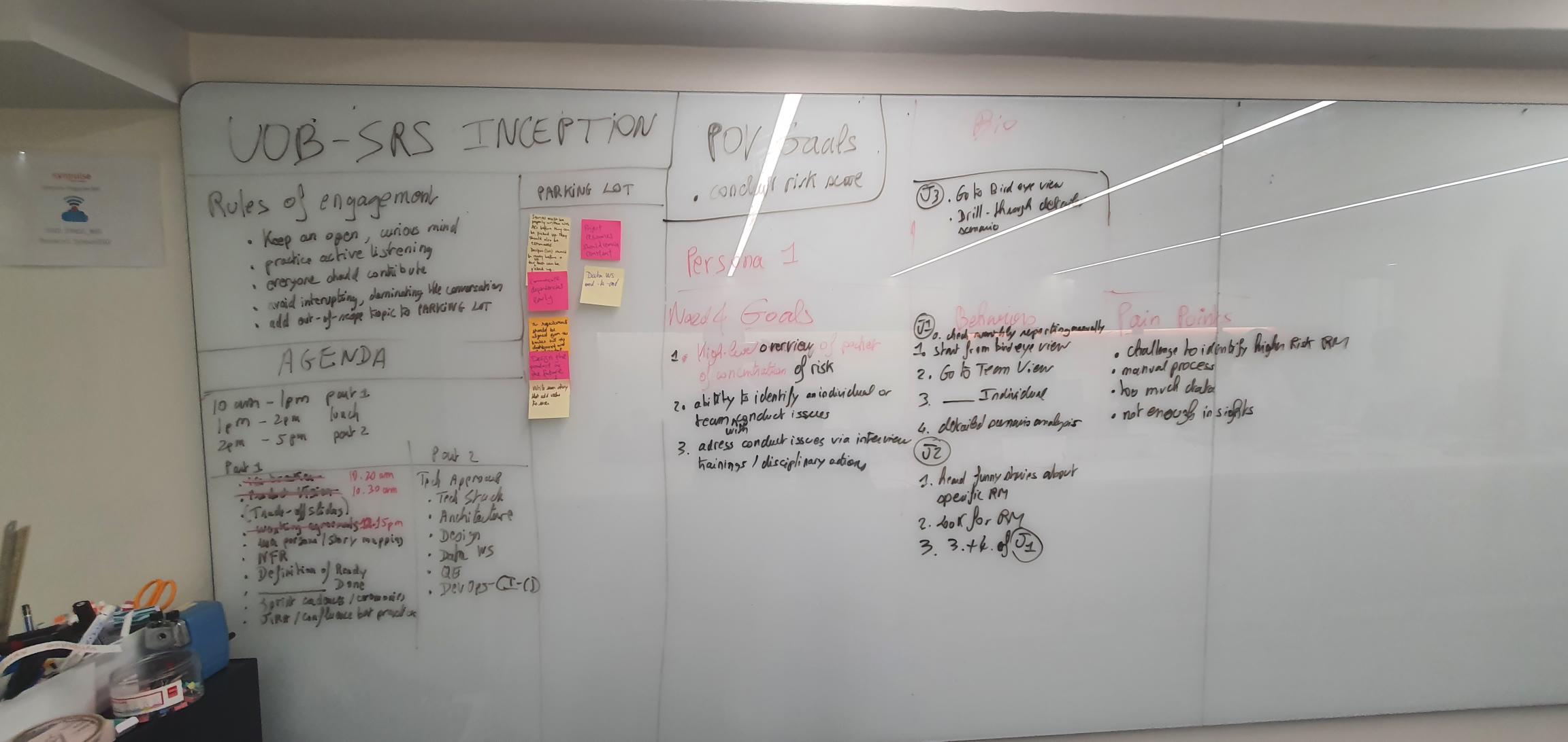
Workshop outcome
Target audience needs & goals, behavior, pain points, and journeys
Workshop #2
Based on the previous workshop outcome, we started mapping user needs and features.
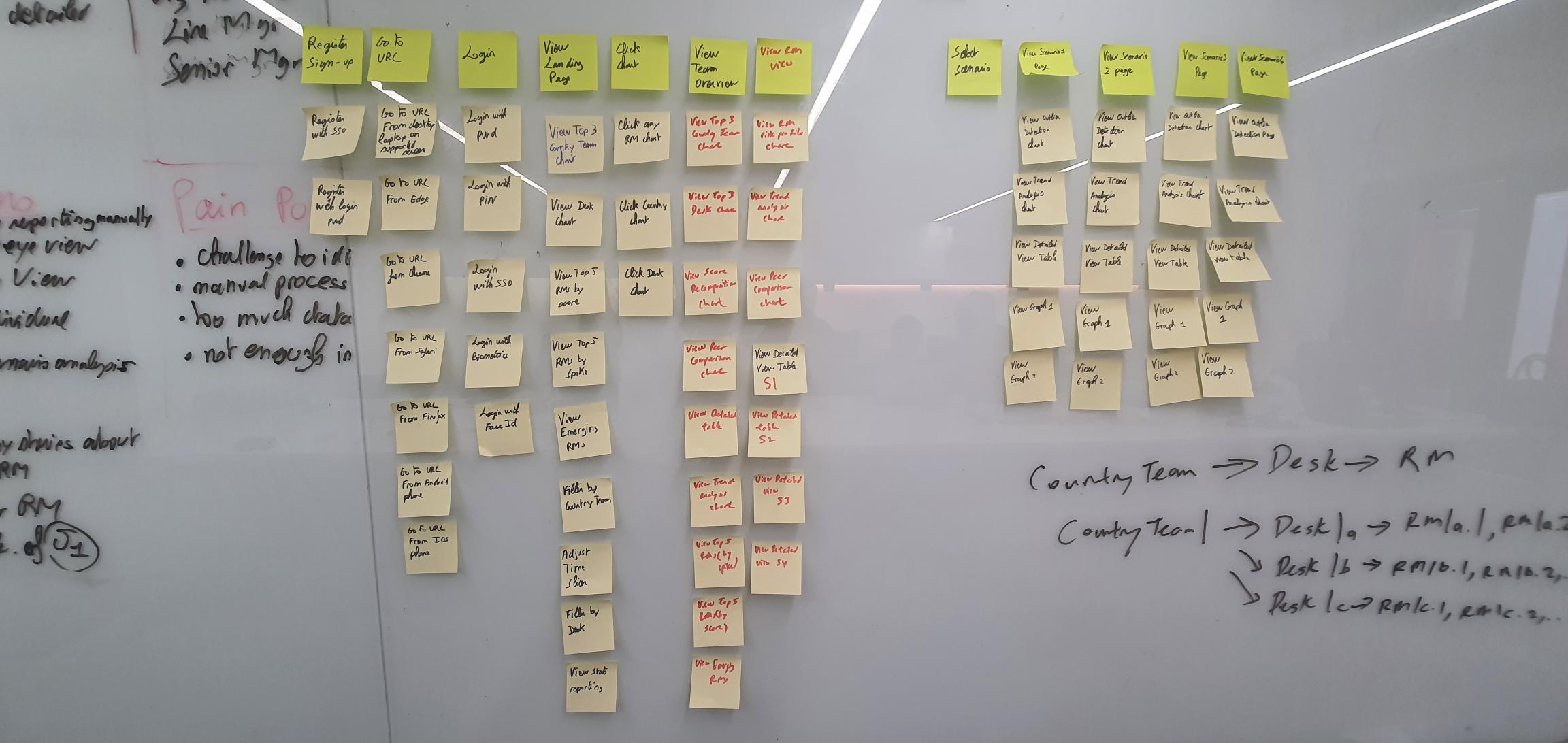
Workshop outcome
List of functions & features that can help users to acheive their goals & needs.
Design pattern
👁️ Navigation
1. Global navigation -
The navigation section leading to the top-level pages of the website which is found on every page. We maximize the finability.


2. Navigation tab -
With tabs, it’s easy for users to know where they are, what they can do there, and where they can go at all times.
Consistent design helps to reduce the amount of cognitive effort required in order to decode the visual representations in a user interface.
Tab labels should be short and sweet; ideally, they should not exceed two words, and they must convey to the users exactly where they will be taken when they click these.

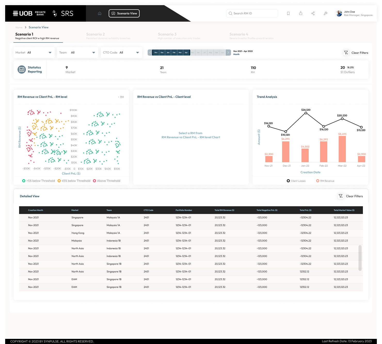
3. Breadcrumb - Breadcrumbs can help users to navigate through a hierarchy quickly and effortlessly.
you need a user interface design pattern that provides direct links to return you to the various levels of the site you previously visited
Breadcrumbs satisfy the users’ needs in this respect, as each visited level in the site hierarchy is represented by a link, allowing the user to jump to a particular page of contents or options in an instant.
🔍 Search
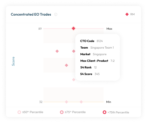
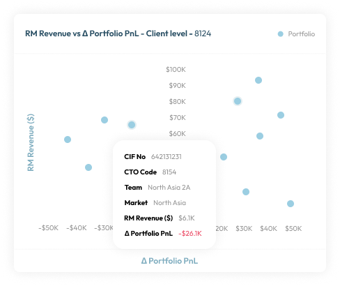
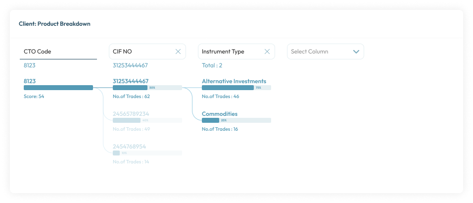
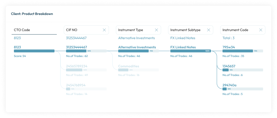
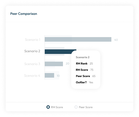
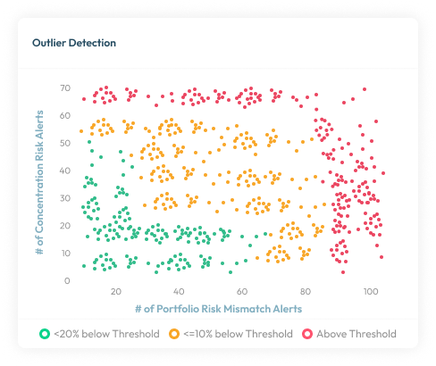
1. Search filter -
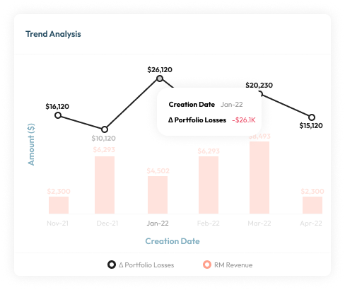
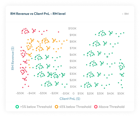
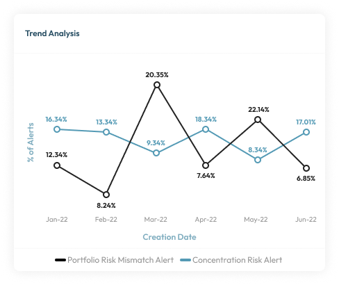
The users can conduct a search using contextual filters that narrow the search results. The search results for a query are very numerous and reviewing them would be very time-consuming. When the filters applied, the followings charts changed to show trend and insights.

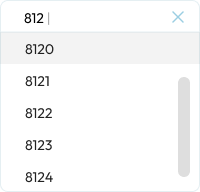
2. Search -
Search lets users control their own destiny. Search is also users' escape hatch when they are stuck in navigation. When they can't find a reasonable place to go next, they often turn to the site's search function. This is why we make search available from every page on the site. We also apply autocomplete and dropdown functions to make the process faster.
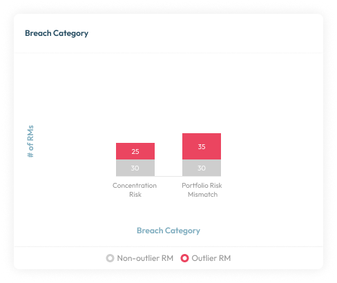
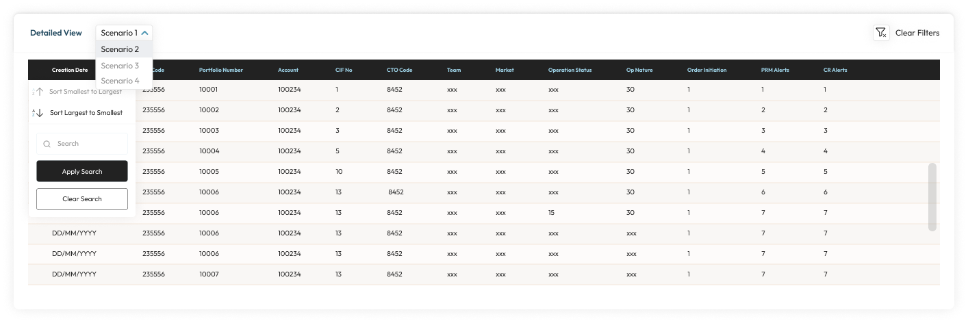
🗄️ Tables
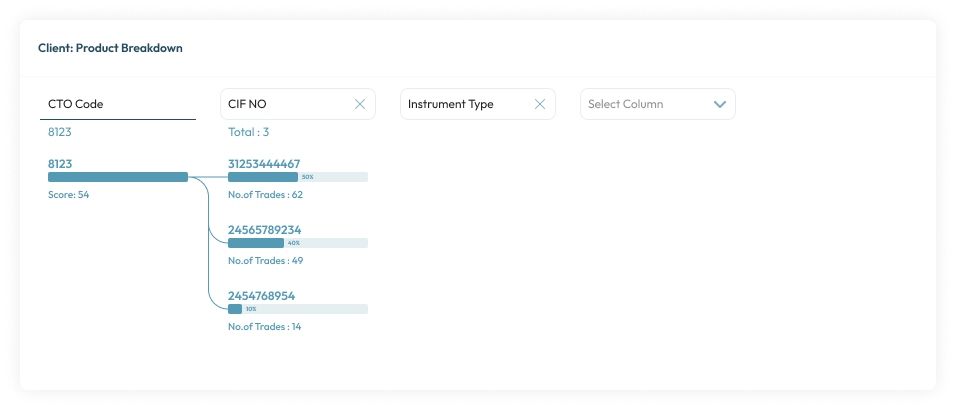
1. Table filter & sort by column -
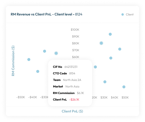
Data can be searched, formatted, overviewed, and browsed in a variety of ways. The user needs to categorical filter the data displayed in tables by the columns. With this pattern, user can easily summarized large data into categories to filter by. User also able to sort the data in a table according to the values of a column.
💡 Discoverable controls
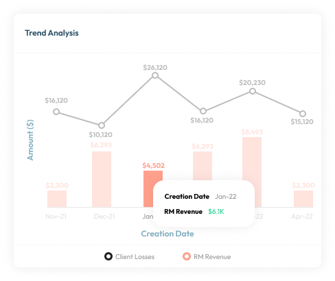
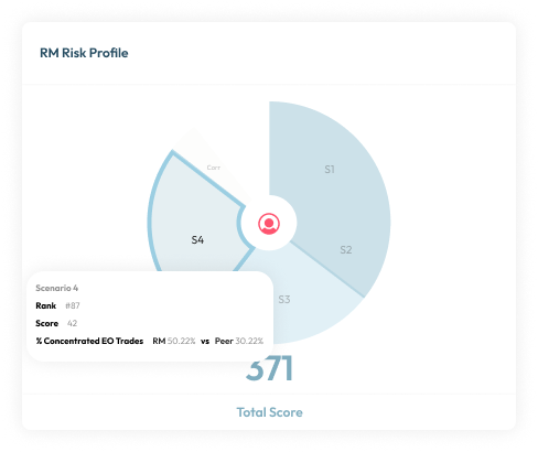
1. Chart -
Discoverable controls are an effective space-saver without sacrificing user functions.
This pattern also makes the controls more comprehensive, especially together with the card grid (a common pairing). Discoverable controls make it clear which card the controls apply to. Universal controls can get confusing with multiple posts, so having the controls appear within the post itself clears this up.