
Fintech Strategy | Brand Transformation | Growth Design | Content Strategy.
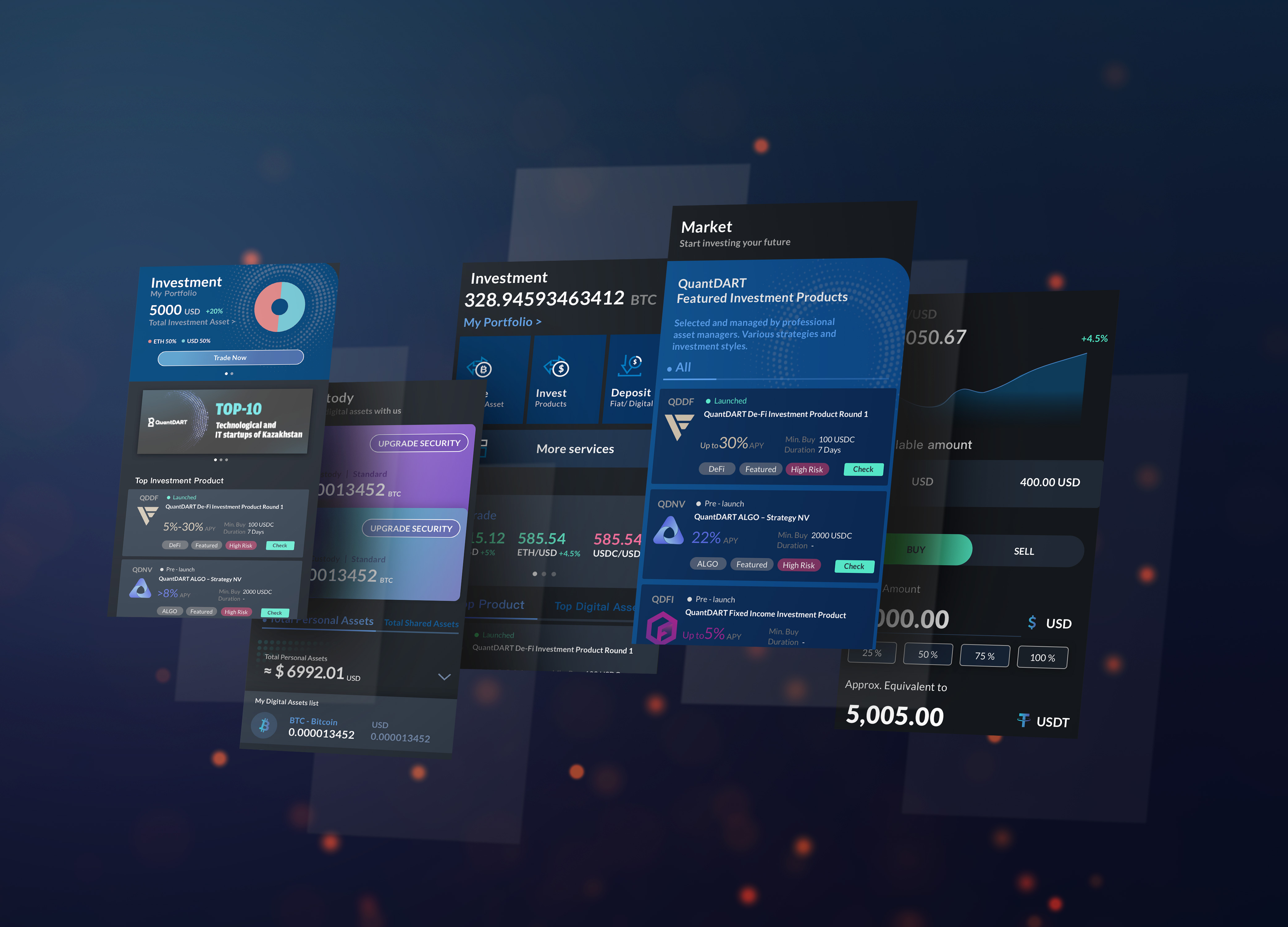
QuantDart: High-Accessibility Crypto Exchange
Redefining the entry point for retail crypto investors through clarity, trust, and simplified onboarding.Key Objective: To lower the barrier to entry for first-time investors by auditing legacy friction points and rebuilding the platform’s trust architecture from the ground up.
Challenge:
How might we empower beginners to navigate the complexities of crypto investing through an interface that prioritizes safety, educational value, and frictionless execution?
My Role:
Product Design Lead
I spearheaded the end-to-end platform revamp, directing the synthesis of brand identity, content strategy, and user-centric flows across Web and Mobile.
Product Design Lead
I spearheaded the end-to-end platform revamp, directing the synthesis of brand identity, content strategy, and user-centric flows across Web and Mobile.
The Delivery:
- Strategic UX Audit & Revamp: Conducted user interviews and workshops to identify "drop-off" points, resulting in a streamlined investment flow.
- Integrated Brand & Style Guide: Led the visual transformation and collaborated with Engineering to ensure high-fidelity implementation of a modern, trust-focused UI.
- Content & Go-To-Market Strategy: Partnered with Marketing to align the product’s voice with beginner-level mental models, ensuring the value proposition is clear from the first touchpoint.
The Impact:
🚀 Reduced Time-to-Investment: Streamlined the "First Trade" journey, significantly lowering the cognitive load for non-technical users.
🚀Enhanced Trust Infrastructure: Implemented a new design language and content framework that improved perceived platform security and brand credibility.
🚀 Cross-Functional Velocity: Accelerated the development cycle by providing a comprehensive Design-to-Dev handoff system and validated technical requirements for the 0-to-1 revamp.
🚀 Data-Driven Iteration: Transformed qualitative interview insights into a prioritized product roadmap, ensuring the redesign solved actual user pain points rather than just visual ones.
Solution
- End-to-End Platform Transformation: Orchestrated a comprehensive revamp of the web and mobile ecosystems, transitioning the platform from a legacy interface to a modern, user-centric investment hub.
- Trust-Focused Content Strategy: Partnered with the Marketing Lead to co-author a high-clarity content framework, translating complex crypto terminology into accessible mental models for first-time investors.
- Strategic UX Optimization: Directed a series of user workshops and deep-dive audits to identify high-friction points, resulting in a streamlined onboarding flow that prioritizes security and ease of entry.
- Unified Design-to-Dev System: Spearheaded the implementation of a new brand identity and scalable design system, working in tight alignment with the engineering team to ensure technical feasibility and pixel-perfect execution.
Design Process
My approach focused on bridging the gap between business growth goals and the user’s need for financial safety.- Strategic Ideation:
Aligning product vision with market opportunities for beginner investors

2. Research & Insight Synthesis:
Translating raw user interview data into actionable product requirements.
Translating raw user interview data into actionable product requirements.

3. Brand Evolution:
Developing a visual language centered on institutional trust and modern accessibility.
![]()
Developing a visual language centered on institutional trust and modern accessibility.


4. System Architecture:
Mapping high-density crypto flows into simplified, logical UX structures.
Mapping high-density crypto flows into simplified, logical UX structures.


5. Prototyping & Validation: Iterating on high-fidelity designs to test clarity and conversion
6. Technical Handoff & QA:
Technical Handoff & QA: Managing the development bridge to ensure design integrity during the build phase — while continuously iterating as the product evolves.
Technical Handoff & QA: Managing the development bridge to ensure design integrity during the build phase — while continuously iterating as the product evolves.
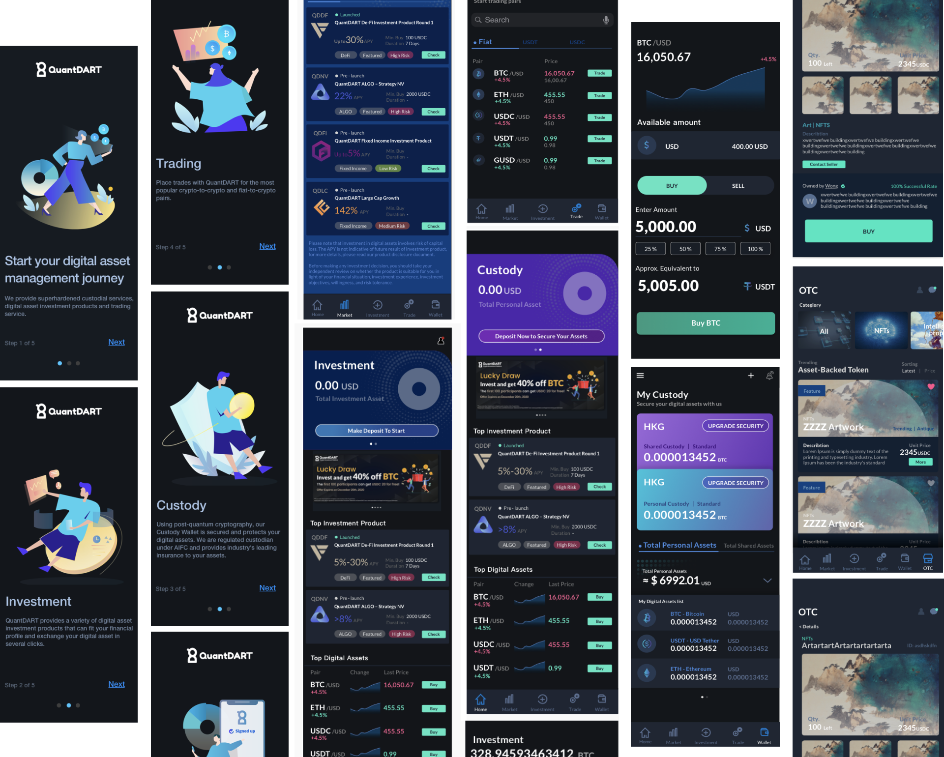
Beyond the App: Brand & Marketing Design
Extending the product experience beyond the app — designing the landing page, illustrations, and marketing materials that brought the brand to life across every touchpoint.Landing Page — Content Strategy & Design
Designed with a top-down content strategy — leading with regulatory trust, followed by brand mission, value propositions, and user-segmented pathways. Each section was purposefully structured to guide different audience types toward the right entry point, turning a marketing page into a conversion-driven experience.


Service Design | Web3 E-commerce | Ecosystem Strategy
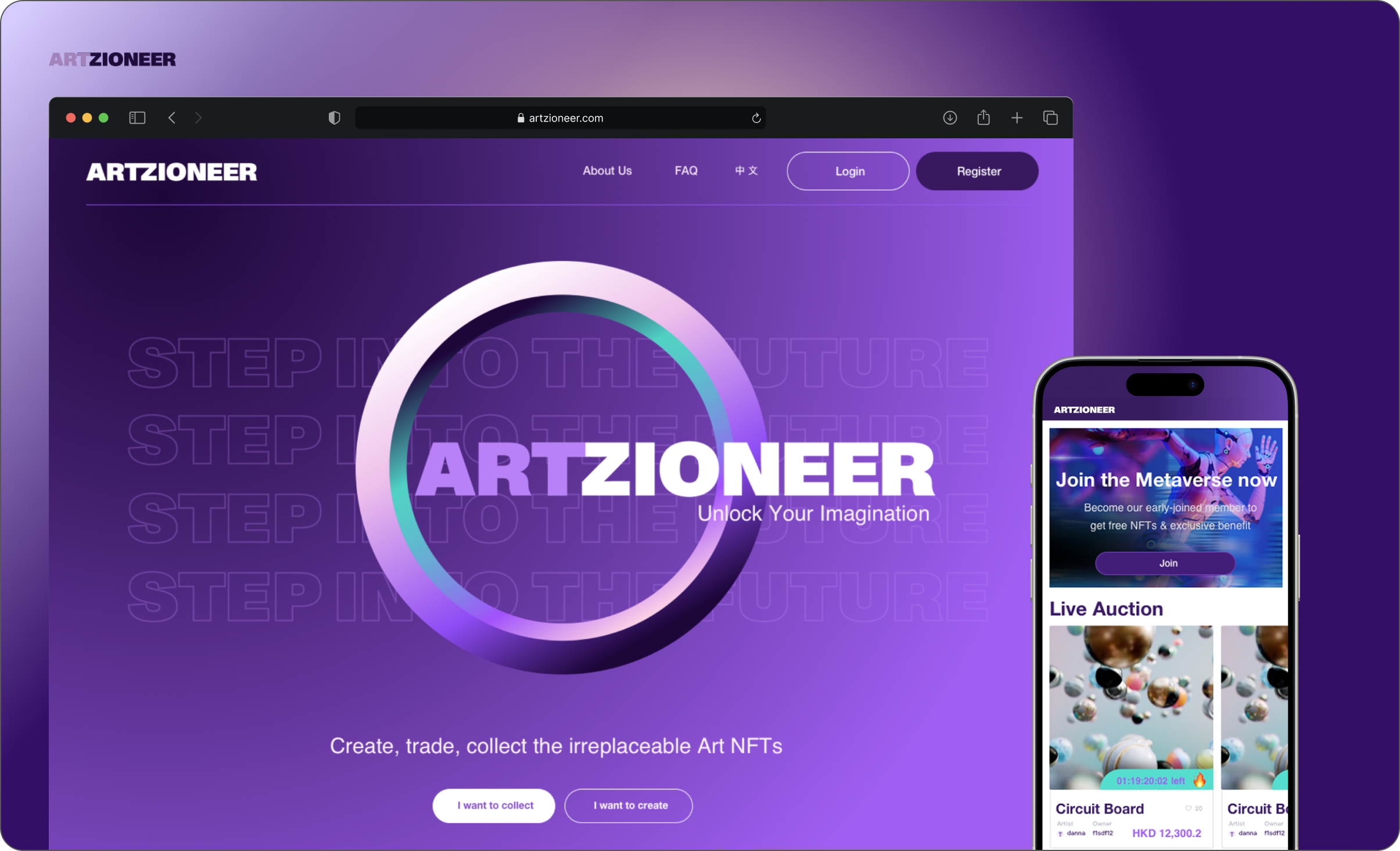
Artzioneer: Cultivating a Bohemian Metaverse
A strategic NFT marketplace designed to empower creators through artistic self-reliance and brand-led digital ecosystems.Key Objective: To architect a high-trust, "one-stop" ecosystem that facilitates both the commercial trade of NFTs and the redemption of physical/digital value, while positioning the brand as an avant-garde leader in the artistic metaverse.
Challenge How might we transform digital assets from speculative commodities into creative tools — bridging technical NFT trading with artistic self-expression, so that brands and artists can collaborate freely without the friction of Web3?
My Role:
UX/UI Lead & Strategy Director
I spearheaded the end-to-end design strategy, brand architecture, and cross-functional execution for the platform's market debut.
UX/UI Lead & Strategy Director
I spearheaded the end-to-end design strategy, brand architecture, and cross-functional execution for the platform's market debut.
The Delivery:
- Service blueprint for NFT redemption
- Landing page (Responsive)
- Marketplace (Web App)
The Impact:
🚀 36% visitor-to-member conversion rate — 1,500+ new registrations at launch
🚀 4,100+ unique visits — validated the "Bohemian Metaverse" value proposition
🚀 Simplified Web3 onboarding — drove significant first-time blockchain user registrations
🚀 36% visitor-to-member conversion rate — 1,500+ new registrations at launch
🚀 4,100+ unique visits — validated the "Bohemian Metaverse" value proposition
🚀 Simplified Web3 onboarding — drove significant first-time blockchain user registrations


Service Design | Information Architecture | Digital Transformation | ESG Strategy | B2B2C Product Strategy
The Henderson: Smart Building Ecosystem
Architecting a multi-platform digital transformation for a landmark Grade-A commercial development.Key Objective: To design and launch a comprehensive "Smart Building" suite comprising 17 functional modules and 3 distinct MVPs, focused on operational efficiency, premium tenant services, and sustainability engagement.
Challenge: How might we synchronize the digital and physical experience for a premium commercial landmark to meet the high-stakes needs of VIP tenants, facility managers, and ESG-conscious professionals?
My Role:
UX Lead
Spearheaded the end-to-end strategy for a 17-module smart building ecosystem, bridging VIP tenant needs with complex operational workflows.
Architected a scalable IA and behavioral persona framework across 3 platforms, facilitating a phased 3-MVP rollout.
Managed executive stakeholders and validated high-risk technical requirements for integrated E-Wallet, IoT, and ESG systems.
The Delivery:
-
Comprehensive Information Architecture: A unified structural map for 17 modules, ensuring seamless navigation across the Mobile App and Web Portals.
-
E-Wallet & Payment UX Flow (Client-Facing app): An end-to-end financial journey for tenants, integrating secure digital payments and "Hendcoin" transactions for building services.
- Operations Dashboard & Account Management: A robust administrative interface for building management to oversee tenant accounts, permissions, and high-level operational data.
- Food & Beverage Integrated Experience (Client-Facing app): A streamlined digital ordering and reservation flow, bridging the gap between luxury tenant needs and onsite hospitality vendors.
The Impact:
🚀Scalable Architecture: Designed a modular system for 17 integrated services, enabling a seamless, phased rollout of 3 distinct MVPs.
🚀Operational Efficiency: Digitized manual facility workflows into a centralized dashboard, drastically reducing response times for tenant requests.
🚀 Behavioral ESG Growth: Engineered the "Hendcoin" loyalty loop, transforming corporate sustainability targets into habitual, gamified tenant actions.
🚀 Strategic Alignment:
Acted as the primary bridge between executive stakeholders and technical teams to ensure business goals met technical feasibility.
🚀 Complex Financial UX: Delivered a high-security E-Wallet & Payment framework, facilitating a robust transactional layer for building-wide commerce.
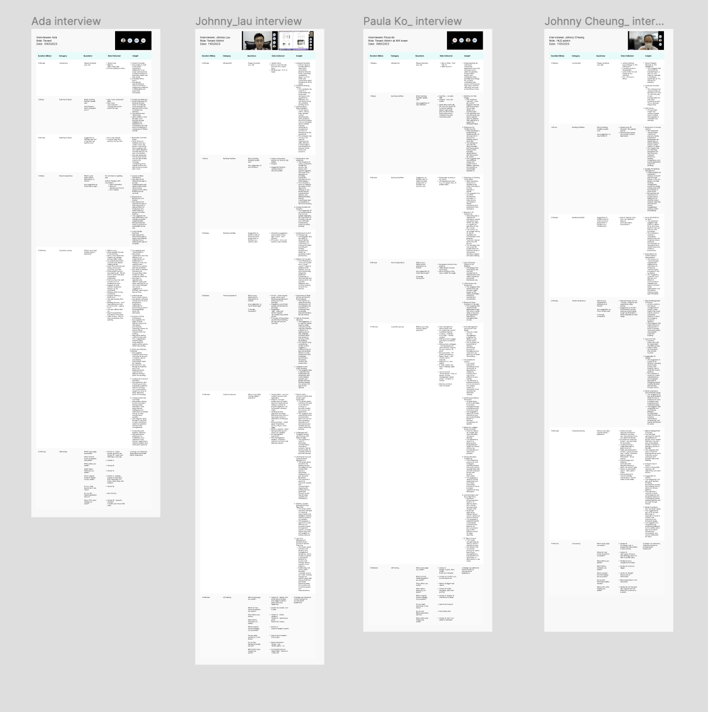
User Interview
User Interviews -
Conducted 4 different interviews with staff of various roles currently working at The Henderson, including Tenant, an Administrator, Leasing Manager, and Facilities Manager. Translated the user research insights into detailed user personas and usage scenarios.
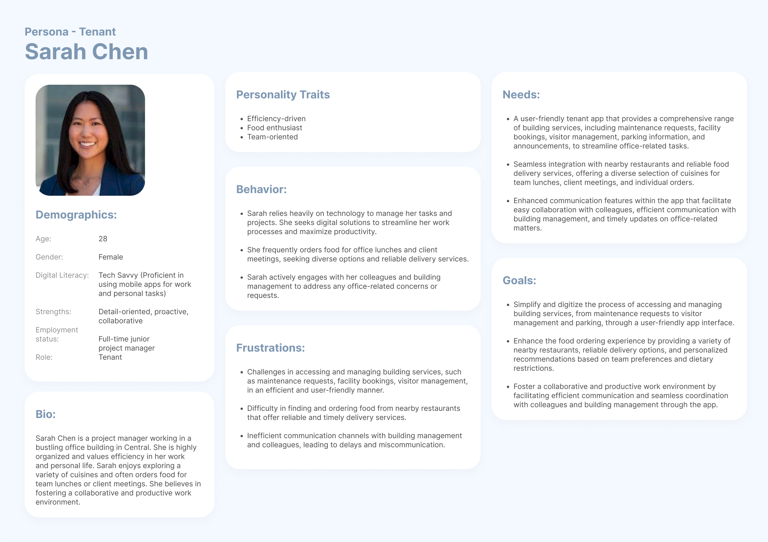
Persona
Persona Creation -
Based on the new product roles, I created 7 detailed user personas. I divided the roles into distinct behavioral profiles to reflect the varied priorities and needs.
For example, take Lisa and Chris. Lisa is a CFO and VIP tenant who leads a busy lifestyle. She is a frequent user of the smart parking features and has higher expectations compared to other users. In contrast, Chris is a mid-level manager with a strong focus on ESG (environmental, social, and governance) initiatives. He is willing to engage more to earn ESG rewards and pays close attention to environmental controls.
These personalized scenarios helped prioritize key functions when building the app or portal. Developing these user personas ensured a user-centric approach to the app design and development.


Customer Journey
Engineering the Sustainability Habit Loop
By synthesizing user motivations with behavioral design, I architected a seamless ESG journey that converts environmental values into habitual action. Through the integration of the Hendcoin rewards ecosystem and localized IoT hardware (RVMs), we transformed a manual recycling task into a high-engagement daily routine. The strategy leveraged a "Dual-Incentive" model—combining intrinsic carbon-reduction goals with extrinsic financial rebates—to drive long-term tenant retention and measurable ESG impact.

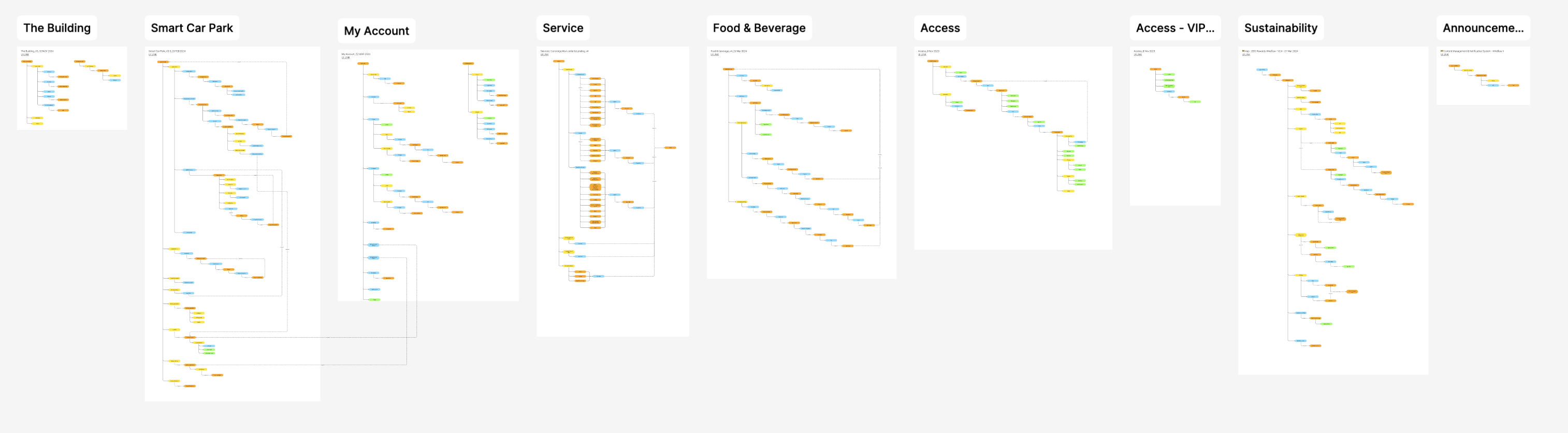
Information Architecture
Mobile App Information Architecture Design
As the lead on the mobile app information architecture (IA), I developed a structured hierarchy consisting of pages, main sections, features, and action buttons. The solid lines represent the page content, while the dashed lines depict the navigation flow.
Creating this IA helped establish a common understanding between the business, tech, and design teams. It ensured consistency in applying key design patterns, such as navigation, bottom sheets, and pop-ups, across the app experience.
By defining this clear IA framework upfront, we were able to align stakeholders, streamline the development process, and maintain a cohesive user experience throughout the app.

User Flow & Wireframe
Food & beverage
Business/ Technical requirement validation
The first step of our process involves business and technical validation. I reviewed the requirements and benchmarked the best industry practices. This validation step ensured the proposed flow and requirements were user-centric, focusing on both usability and technical feasibility.

User flow design
I designed the user flow, incorporating elements such as in-app navigation, user decision points, user control mechanisms, and error handling. Additionally, I created a chart illustrating the interactions between notifications, client actions, restaurant actions, and third-party integrations. This visual aid was intended to facilitate better communication and alignment across the team.
Wireframe Design
I designed one of the sections using a sketch-based approach. This method allowed for quickly illustrating ideas and putting them into team discussions for feedback and validation.

UI Design
After the UX design process, I handed off the work to the UI team. In this subsequent phase, my role was to monitor the progress, provide UI enhancements, and ensure the UX flow and microcopy were properly aligned.


FinTech Strategy | Institutional UX | Trading Systems | Compliance & Risk Frameworks
Bullish: Institutional OTC Trade Builder
Architecting a high-throughput negotiation and execution engine for institutional-scale digital asset transactions.Key Objective: To build a bespoke "request-for-quote" (RFQ) and trade-building environment that allows institutional counterparties to execute large-block orders with minimal slippage and maximum privacy.
Challenge: How might we design a high-precision tool for pro-traders that facilitates over-the-counter (OTC) trading, enabling the seamless execution of high-volume transactions while maintaining the rigorous transparency and risk management standards of a regulated exchange?
My Role:
Senior Product Designer
Responsible for translating complex institutional trading workflows into a streamlined, compliant OTC negotiation interface.
Senior Product Designer
Responsible for translating complex institutional trading workflows into a streamlined, compliant OTC negotiation interface.
The Delivery:
- Strategic UX Flow:
End-to-end negotiation-to-settlement journey for complex OTC products.
- Pro-Trader Interface (Responsive):
A high-density, low-latency UI optimized for rapid decision-making.
- System Validation: Collaborative refinement of business and technical requirements with institutional stakeholders to ensure SOC2 and regulatory alignment.
The Impact:
🚀 Institutional Scaling: Supported a platform that reached $244.8 billion in annual digital asset sales (FY 2025), catering specifically to institutional-grade trading requirements.
🚀Rapid Adoption: Supported a product environment that enabled Bullish to become a Top 5 global venue by BTC volume and the #2 exchange for BTC options open interest ($4B as of Jan 2026).
🚀 Proven Reliability: Designed for a platform trusted by the world's largest liquidity providers (e.g., B2C2), facilitating seamless 24/7/365 institutional execution.
Feature Brief
The OTC UI provides a user interface to all the functionality provided by the OTC Trade facility. The primary features are:
- OTC Booking UI: Provides an interface for users to book an OTC trade
- OTC Match Blotter: View a live blotter of users’ OTC trades and status
- OTC Positions: View all OTC positions held at Bullish
- OTC Trades: View the history of OTC trade bookings and trade legs
1. Market Research
OTC vs RFQ Trading -
Market Insight:
In the current market, tools for Over-The-Counter (OTC) trading are limited, especially for pro traders. Instead, Request for Quote (RFQ) systems are more commonly used—particularly by retail clients.
Below is a comparison highlighting the key differences between OTC trading and RFQ:
2. Competitive Analysis
Derbit & Binance flow, features, UIUX analysis -
I analyzed the RFQ functions of two key industry players: Deribit (a leader in options and futures trading) and Binance (a leading retail crypto exchange). The review focused on their trading flows, feature sets, and included a UI/UX analysis to identify best practices and gaps.

3. Design Approach
Existing modal Audition(Bullish) -
Identifying reusable design patterns to implement new functions across the platform — ensuring UI/UX consistency while reducing development effort and improving scalability.
4. Design Process:
Ecosystem Flow Design Process -
I began by designing the overall user flow to understand how the ecosystem functions when a trade order is initiated within the OTC Trade Builder.
Trader Builder Flow Design Process -
I conducted a deep dive into the Cornea flow, detailing how users can construct a trade, add legs, simulate amount and risk, submit, and cancel orders within the interface.
Wireframe Exploration:
Builder structure -
I designed multiple wireframe options to help the business and development teams evaluate different structural approaches for the OTC Trade Builder:
- Option 1: "Partial Reveal" – Optimized for a more engaging experience by progressively disclosing information, helping users manage complexity and reduce information overload.
- Option 2: "Parallel Design" – Focused on efficiency, allowing traders to view and compare multiple trade components side by side to support faster decision-making.
Final Structure Design Decision:
The final approach reflects a constructive trade-off between business goals and stakeholder feedback, with a clear priority placed on streamlining the trade construction process to best support user needs and strategic objectives.
UI design:
Screen Flow Design-
I designed responsive desktop, tablet, and mobile versions of the OTC Trade Builder to ensure seamless Day 1 adoption across all key platforms and user environments.


Extreme Case Design -
Button and Data Overload in One Row
Objective
To test the limits of usability and visual clarity when an interface row must display:- Multiple action buttons
- High-volume data fields
- Limited horizontal space in mobile
Design Considerations
-
Action Prioritization
- Use of space-saving patterns (iconography)
-
Use of a long-press gesture for the device
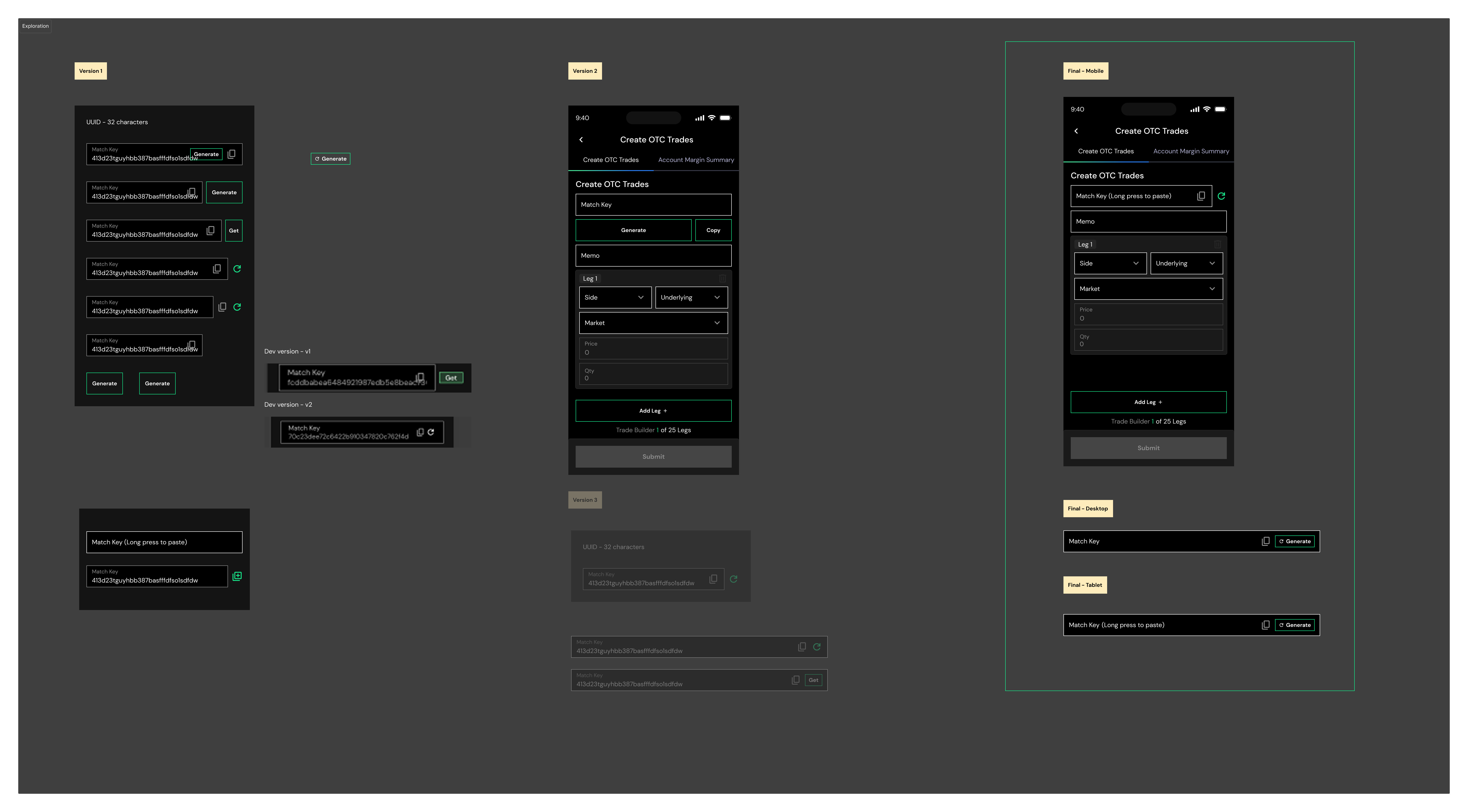
Agile Collaboration:
Future version (Adding trade with strategies) -
Following an agile approach, I typically provide multiple design versions to support the development team’s adaptation, aligning with their implementation timelines and sprint goals.

Launched: Sep 2025 | Product Link
Further Reading:
Option Trading Reward Program Dashboard

Strategy:
Scales institutional liquidity by transforming complex incentive structures into a transparent, gamified performance ecosystem. By tracking real-time market share and leaderboards, it leverages behavioral psychology to stimulate high-volume trading among top-tier participants.
Scales institutional liquidity by transforming complex incentive structures into a transparent, gamified performance ecosystem. By tracking real-time market share and leaderboards, it leverages behavioral psychology to stimulate high-volume trading among top-tier participants.
UX:
Reduces cognitive load by distilling multi-variable financial math into a skimmable, top-down hierarchy. Clear metric anchors provide instant performance validation, while a clear three-step calculation breakdown removes ambiguity for busy traders.
Reduces cognitive load by distilling multi-variable financial math into a skimmable, top-down hierarchy. Clear metric anchors provide instant performance validation, while a clear three-step calculation breakdown removes ambiguity for busy traders.
UI:
Utilizes a premium, high-contrast dark-mode theme engineered for high-density terminal screens. Complex data—like margin thresholds and reward pool distributions—is communicated via clean, minimal data visualizations that maximize readability under pressure.
Utilizes a premium, high-contrast dark-mode theme engineered for high-density terminal screens. Complex data—like margin thresholds and reward pool distributions—is communicated via clean, minimal data visualizations that maximize readability under pressure.
Further Reading:
How do I balance business goals with user needs when conflicts arise?
Case: Options Ladder — Order Panel Direction (Left or Right)

Business Goals:🎯 Consistency with existing left-side navigation drawer pattern
🎯 Reduce additional development effort
🎯 Keep primary actions (Buy/Sell) predictable across the platform
🎯 Reduce additional development effort
🎯 Keep primary actions (Buy/Sell) predictable across the platform
User Needs:
👤 Natural thumb reach — right-hand dominant users swipe from the right
👤 Clear distinction between navigation and action panels
👤 Intuitive access without losing context of the ladder data
👤 Natural thumb reach — right-hand dominant users swipe from the right
👤 Clear distinction between navigation and action panels
👤 Intuitive access without losing context of the ladder data
The Conflict
“Business preferred left for pattern consistency, while users found right more natural and thumb-friendly.”
How did I frame the tradeoff?
Rather than choosing one side, I reframed it — two drawers from the same direction create confusion.
Usability testing showed users hesitated, swiped incorrectly, and missed the panel when it came from the left. The data made the conversation objective, not opinionated.
The Decision
- Left = Navigation & Menu
- Right = Order Panel & Actions
The directional difference became intentional spatial logic, not an inconsistency.
The Outcome
- Business retained a distinguishable, consistent navigation pattern
- Users gained an intuitive, one-handed interaction that matched their expectations
✨ The Takeaway
"The best resolution isn't always a compromise — sometimes reframing the problem reveals a solution that serves both sides better."
Instead of framing it as "left vs right" (a binary choice), I shifted the question to "how do two drawers coexist without confusing users?"
This changes the nature of the conversation from a debate about preference to a design systems question about spatial logic.
Instead of framing it as "left vs right" (a binary choice), I shifted the question to "how do two drawers coexist without confusing users?"
This changes the nature of the conversation from a debate about preference to a design systems question about spatial logic.


AI-Driven AdTech | Data Visualization | Systemic Design Tokens | Predictive UX Analytics | Strategic Benchmarking
RevoSurge: Architecting an AI-Powered DSP Ecosystem
Empowering media-buying intelligence through predictive analytics and systemic design precision.Key Objective: To architect a high-velocity, performance-driven digital ecosystem that eliminates operational friction and accelerates user time-to-value. The primary focus was to instrument real-time data tracking and interactive workflows that lower Customer Effort Scores (CES), converting complex system features into an intuitive, high-adoption experience built for modern scalability.
Challenge:
How might we transform the high-friction, data-heavy ad-buying process into an intuitive, AI-augmented workflow that enables faster, more confident decision-making for global media executives?
The Client:
RevoSurge
(Dual-Platform Ad-Buy & Analytics Suite)
RevoSurge
(Dual-Platform Ad-Buy & Analytics Suite)
My Role:
Lead UI/UX Designer
Spearheaded the 0-to-1 design strategy for two interconnected platforms: AdWave (Campaign Management) and DataPulse (Real-time Analytics).
Lead UI/UX Designer
Spearheaded the 0-to-1 design strategy for two interconnected platforms: AdWave (Campaign Management) and DataPulse (Real-time Analytics).
The Delivery:
- Ecosystem Architecture & PRD Audit: Orchestrated a comprehensive audit of the Product Requirements Document and legacy dev screens. I mapped a unified Information Architecture (IA) that aligned the technical scope with the executive vision, ensuring cross-platform navigation was seamless.
- Competitive Intelligence: Led a deep-dive UI/UX evaluation of market leaders (Skai and Axon AI). This analysis identified critical gaps in existing "Create Campaign" flows, allowing us to leapfrog competitors by integrating real-time AI bidding recommendations.
- AI-Enhanced Workflow Design: Dynamic Targeting: Leveraged predictive algorithms to simplify audience segmentation.
- Automated Optimization: Integrated AI-driven "Bid & Budget" recommendations, transforming manual data-crunching into effortless, data-driven decisions.
- Data Visualization Strategy: Architected the DataPulse platform with a focus on "Clarity-at-Scale." By utilizing AI for trend forecasting, I designed interfaces that move beyond historical data to provide users with proactive, forward-looking insights.
- Advanced Design System (The 4px Logic): Developed a foundational design system using Design Tokens. I strategically evolved the 4px grid system to include "Practical Flexibility"—optimizing font scales (10px-14px) and icon padding for dense data environments where standard spacing fails to maintain legibility.
The Impact:
🚀 Operational Velocity & Scalability:
Implemented a tokenized 4px grid system and modular component library, reducing design-to-dev friction and handoff time by 40%. This infrastructure ensured a high-fidelity 0-to-1 launch within a strict 3-month timeline while minimizing engineering rework.
🚀 Strategic Decision Intelligence:
Architected AI-driven predictive visualizations and trend forecasting that accelerated executive decision-making speed by 30%. By distilling complex data into proactive insights, I reduced user cognitive load and transformed the platform into a high-trust decision engine.
🚀 Commercial ROI & Growth Strategy:
Engineered behavioral "Incentive Loops" using AI bid recommendations that fostered user trust and encouraged recurring platform spend. This design-led approach directly aligned UX with business profitability, creating a scalable path for long-term user retention and revenue.
Project Brief
Designing two interconnected platforms that empower users to streamline the ad-buy process, optimize campaigns, and gain actionable insights. The goal is to enable quick decision-making and iterative improvements, creating a continuous cycle of optimization and recurring profitability.
Beta Version -
"A foundational, scalable platform with a simple yet actionable workflow, powered by lightweight AI functionality to deliver immediate value while laying the groundwork for future growth."
Discovery phase -
1. PRD & existing screens audition
I utilized flowcharts to audit the Product Requirements Document (PRD) for clarity and alignment.
Additionally, I reviewed the screens developed by the dev team, ensuring consistency with the design vision, while auditing data structures and site architecture for usability and functionality.


Discovery phase -
2. Competitive Analysis

Skai & Axon flow, features, UIUX analysis (Create campaign flow) -
I conducted a detailed analysis of the 'Create Campaign' functionality of two key industry players: Skai, a leader in omnichannel marketing, and Axon AI, a market leader in mobile and performance advertising as of 2026. This review focused on their campaign creation flow, incorporating a UI/UX evaluation to identify best practices and uncover gaps in AI integration.


3. Design Process:
IA & ecosystem Design -
I started by designing the Information Architecture (IA) and ecosystem flow to align the team's vision, streamline the breakdown of work scope, and ensure seamless navigation for an intuitive user experience.


Color & Style Exploration -
I researched leading AI and ad-buy companies to identify the ideal primary color that aligns with industry standards and brand identity. I then adapted the color scale to the UI and performed thorough testing to ensure consistency, accessibility, and visual impact.


UI&UX design -
A. Screen Flow Design-
Adwave -
I designed the desktop versions of AdWave, creating a seamless experience for onboarding, product creation, campaign management, creating audience segments, and analysis. The design prioritizes clarity, usability, and an intuitive workflow to enhance the client experience.


💡 AI in create campaign flow

Audience Targeting
Implemented dynamic audience targeting by leveraging real-time data and predictive algorithms, enabling precise and personalized campaign strategies that adapt to user behavior and preferences.
Create campaign
Leveraging target events to set up campaigns simplifies the process, significantly reducing both time and complexity for users."


Set bid & budget
Deliver actionable recommendations to optimize bid and budget settings, empowering users to make data-driven decisions with ease.
DataPulse -
I have also designed the desktop versions of DataPulse, delivering a seamless experience for overview analysis, real-time insights, reporting, and user exploration. The design prioritizes data visualization, ensuring clarity, accessibility, and actionable insights for users.

💡 AI in Data


Predictive Insights and Trend Forecasting
Incorporating AI into UX design allows for the seamless integration of predictive insights and trend forecasting, enhancing user decision-making and platform engagement.
I utilized AI-powered predictive insights and trend forecasts to design performance trend visualizations that provide users with actionable data.
By delivering weekly forecasts and insights, users are empowered to make informed decisions, optimize their campaigns, and plan strategically for future performance.
These insights not only improve the user experience but also encourage users to create new campaigns, fostering recurring income for the platform while driving long-term value for both the users and the business.
Design Tokens Design -
I developed small, reusable design elements that form the foundation of a cohesive design system, streamlining the visual style and ensuring consistency across platforms.


︎4px grid system in practical consideration -
Strict structure vs. Practical flexibility
<Font size setting>
When setting up design tokens for spacing and font sizes, I adjusted the smaller font sizes from the standard 8, 12, 16, 20, 24, 32, 40, etc. to 10, 12, 14, 20, 24, 32 to better suit a data-heavy platform.
Although this approach deviates from a strict 4px grid system, it improves usability for smaller text elements in tables, charts, and forms, ensuring better readability and functionality in dense data environments.


<Padding & spacing in UI elements>
When it comes to padding within elements, spacing strictly follows the 4px grid. However, different approaches are applied to the spacing between icons and text, depending on the purpose:
When it comes to padding within elements, spacing strictly follows the 4px grid. However, different approaches are applied to the spacing between icons and text, depending on the purpose:
- Button text-icon padding: A 2px spacing is used to create a more compact look, supporting the text without taking up excessive space.
- Status tag text-icon padding: A 4px spacing is used to make the icon more prominent and visually distinct, aligning with its purpose as an indicator within tables.
Componenet Design -
I designed Date Picker, Table Filter, Log List, and Table & Chart are design user-friendly, data-driven, and functional interfaces.
︎Date Picker
A Date Picker is an essential tool for reporting and analytics, enabling users to select specific timeframes with ease. By offering features like range selection and preset options, it ensures accurate insights while minimizing user errors.
A Date Picker is an essential tool for reporting and analytics, enabling users to select specific timeframes with ease. By offering features like range selection and preset options, it ensures accurate insights while minimizing user errors.


︎Table Filter
Table Filter enables users to sort and refine data, making it easier to locate specific information efficiently. With features like multi-criteria filtering, search-as-you-type functionality, and the option to save filter presets, it simplifies complex datasets and boosts user productivity.
Table Filter enables users to sort and refine data, making it easier to locate specific information efficiently. With features like multi-criteria filtering, search-as-you-type functionality, and the option to save filter presets, it simplifies complex datasets and boosts user productivity.
︎Log list
Effective log design allows users to quickly scan, search, and interpret information, even within dense or real-time data streams. A well-designed log is responsive and optimized for visibility across different screen sizes, ensuring a seamless user experience.
Effective log design allows users to quickly scan, search, and interpret information, even within dense or real-time data streams. A well-designed log is responsive and optimized for visibility across different screen sizes, ensuring a seamless user experience.

Balancing functionality, aesthetics, and efficiency in data visualization, allowing users to seamlessly switch between detailed data (tables) and high-level trends (charts). Interactions like hover, tooltips, or clicks partially reveal data, enhancing users' understanding.


Launched: Feb 2026